
Is your wordpress website mobile-friendly? Do you even know? Lucky for you, Google has launched a free tool to check mobile-compatibility: https://www.google.com/webmasters/tools/mobile-friendly.
If your website IS NOT mobile-friendly, it’s becoming increasingly important that you adapt to the change in technology and user behavior. We’ve outlined 3 options below for converting your website into a mobile-friendly format that engages your audience anywhere, anytime.
1. Mobile Plugin
The first and most cost-effective option is to install a mobile plugin that automatically detects a user’s resolution and if they are viewing your website under a specific resolution (ex. 480 pixels), it triggers a new mobile-friendly theme. This is a great option for budget-conscious websites that are looking for a quick and affordable solution.
Advantages:
- Very affordable with little to no reoccurring cost
- Easy to install and configure
Disadvantages:
- Template-based design is limited
- Does not maintain website look and feel
- May not display custom post-type content well
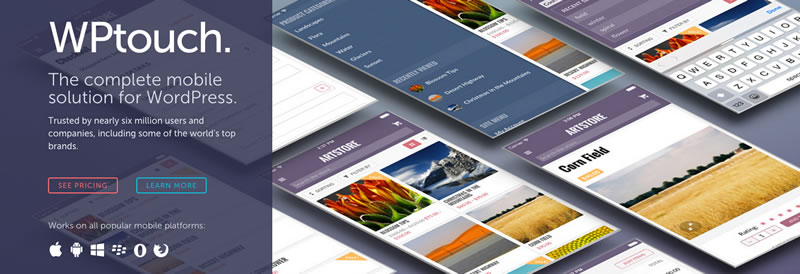
An example of a mobile plugin that we recommend is: http://www.wptouch.com.
2. Existing Website Conversion
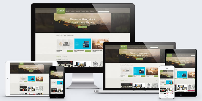
The second option is to convert your existing website into a mobile-friendly or “responsive” format. Basically your website would “respond” to a variety resolutions – whether it be mobile or desktop.
Advantages:
- Highly-custom solution
- Seamless look & feel
- Ability to display almost all content
Disadvantages:
- A little more of an up-front investment
- Project length is a little longer
3. New Mobile-friendly Website
The last option is to create a brand new website that has built-in mobile-friendly features and responsive behavior. While the up-front expense is higher and the project length is longer, this is a great fit for companies thinking about a website redesign because you can package mobile-friendly features into the project.
Advantages:
- Brand new website design
- Professional, mobile-friendly responsiveness
Disadvantages:
- Most expensive solution
- Longest project length
Hungry for more?
Explore our mobile-friendly conversion packages to help you convert your wordpress site into a fully-functioning, mobile-friendly website.
[bra_button text=”Explore Our WordPress Conversion Packages” url=”https://sproutbox.co/mobile-friendly-website-conversion” size=”large” color=”greenbtn” target=”_self”]