Remember when you had to dial-up your modem to login to AOL and view the news? Well, the times have changed my friend. Below are a few new trends in web design that we’ll explore.
Responsive Web Design
The last few years have seen a major shift from fixed web design to responsive web design. In a nutshell, responsive web design means a website “responds” to a device’s resolution. Responsive websites are mobile-friendly because they adapt to the different screen sizes. In most cases, responsive web design is a fantastic solution to the growing demand for mobile consumption of information.
The Good: You can build a single website that responds to many devices without having to build mobile-specific websites or applications.
The Bad: When viewed on smaller devices, the content stacks which means the user must scroll through large amounts of data because it’s stacked in a long narrow fashion. Not always user-friendly.
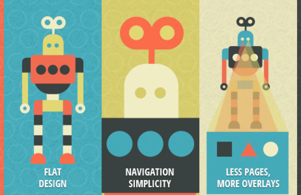
Flat Design
Like many trends, flat web design is hugely popular right now but will fade with time. We’ve seen a huge influx in flat web design over the last year – due in part to mobile app design. Many iphone and android apps have begun shifting to flat design (including apple and google) which has had a major influence on digital design.
The Good: Flat web design is simple and feels approachable. Used strategically, flat web design can be an engaging way to communicate with customers.
The Bad: We’re likely approaching the peak of flat web design. The trend will be on a downward trend soon and many websites that have overly-embraced flat web design will need to make major updates to stay current.
Simple Navigation
Finally, a web design trend that “should” stay around for a while – at least we hope. As consumers become more and more intelligent in the way they consume content, we (as marketers) need to provide ways that meet their needs. Simple navigation is one of the most important pieces of a successful website and should be strategic in nature. We recommend understanding your buyer personas so that you can create simple navigation around their individual needs.
The Good: Simple navigation is easier to manage and has higher click-through rates and conversions.
The Bad: Sometimes if the navigation is too simple, users will bounce because they aren’t finding what they are looking for.
Less Pages, More Overlays
As modern web design evolves, the technology that powers user experiences continues to change. Modal boxes (overlays) have become widely popular as marketers look to engage users more quickly. A modal box or overlay, is a box that appears “over” an existing page and usually has a dark or light transparent background. You’ll see a lot of these boxes prompting or asking the user to do something (sign up, subscribe etc). Overlays can also be content-based and in some cases, replace pages.
The Good: Overlays are a great way to quickly engage users without making them navigate away to another page.
The Bad: Many overlays are not mobile-friendly and less pages means less search engine optimization authority.
Parallax Scrolling
If you haven’t heard about parallax scrolling, you’ve been living under a rock for the past year (we’re sorry if you’ve really been living under a rock). Without going into too much detail, parallax scrolling is when a user scrolls down a page, the background stays “fixed” and only the content scrolls. It’s a unique design technique that some people love and some people hate.
The Good: Parallax scrolling can be a very smooth, engaging user experience (if done right). It can feel very professional and modern.
The Bad: There are different methods and some are not mobile-friendly. Also, some people have a very adverse experience with parallax and will immediately bounce.
