
Introduction
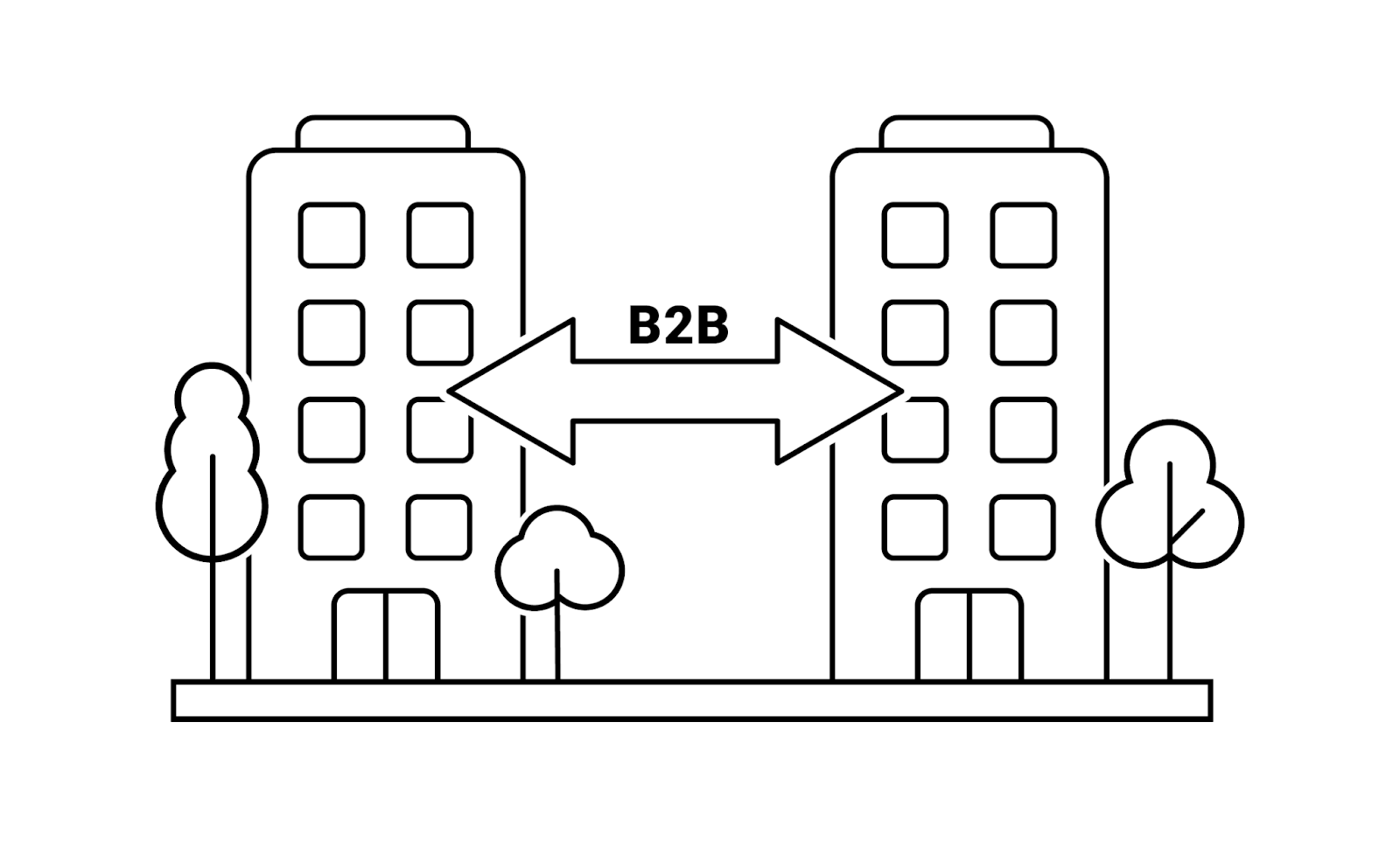
Marketing your business online is important, especially when it comes to selling business-to-business (B2B) services. Not only do you need to deliver a clear message about your business and its offerings, but you also need to establish trust and interest that can influence them at any point in the buying process.
What is a service page on a B2B website?
A service page is an area of your business website that lists and defines your service offerings. In a sense, your service pages should act as a ‘sales representative’ that makes it quick and accessible for customers to find out more about your services, find answers to their questions, and access the solutions that address their areas of need.
What does an effective website look like?
There are a few key indicators of an effective service page based on engagement and conversions. Ideally, visitors will easily discover your site via organic search and that same visitor will engage with your content that guides them through the decision making process. From then on, successful user experience is measured by your desired conversions–whether that be an actual purchase or filling out a contact form. Ultimately, if your service pages succeed at influencing visitors to convert, your pages are effective.
How do you create a B2B service page for your website?
Most visitors will spend less than a minute on your website but their first impression is formed within 3 seconds of arriving on your landing page. Considering the narrow attention span of most individuals, you should strive to capture attention and show value in a quick and powerful way, otherwise those potential customers will not hesitate to seek answers to their inquiries on another site. There are a few different tactics to ensure you achieve that quality first impression:
Short and descriptive headline – The headers you choose to include on your service pages need to be thoughtful, clear, and concise. Visitors should not have to scour your site to discover the reason why they were led to your page in the first place. Each header should serve to create a strong web-based value proposition that immediately describes your product or service – don’t make your visitor guess what you sell or do. This unique proposition can be conveyed through messaging but also through design, imagery, and functionality of your service pages.
Meaningful subheadings – Following a similar structure as headlines, your subheadings should include a quick foreshadow for what is to come in the subsequent content. You want to provide enough information to allow visitors to decide which areas of your site are of interest to them without forcing them to dig through paragraphs of content. This contributes to a positive user experience that allows readers to easily flow through the content on your site pages.
Choose specific phrases that inform and entice instead of general subheadings such as “who we are” and “what we do”. Specificity is beneficial for not only your readers but it benefits your search engine rankings as well.
Keyword focus – Arguably, one of the most important aspects of your service page development is the strategic keyword use included in your messaging. Not only is this important to direct your visitors to the content they are looking for once they land on your site, but it is also crucial to help search engines place your site in front of potential customers.
The goal is to align the content of your site pages with keyphrases that your audience is frequently searching for. Users are constantly searching for services based on keyphrases with good ‘buying intent’. To discover these specific keywords, you need to research keyphrases with a high search volume and a lower level of competition.
Short paragraphs and plenty of formatting – Today’s consumers expect quick, concise solutions to their needs. Keeping this in mind, you should avoid burying information in dense paragraphs that are hard to digest. Instead of taking the time to read extensive content, your consumer will either scan it or look to other sites to find more simplified answers to their questions. To ensure visitors needs are met by the content on your site, consider the following general rules:
- Break up paragraphs – Once a paragraph exceeds 3 lines, break the information into 2 more digestible sections.
- Mix in varied formatting – Don’t be afraid to utilize bullets or numbered lists, different font variations, images, and internal links to break up your copy. Adding a little bit of white space never hurts either.
Content, content, content – It’s no secret that every word you incorporate in your service pages should be intentional and strategic. So what kind of content should you include?
- Avoid industry specific jargon: As a rule of thumb, the content on your site should be easily understood, even if a reader is unfamiliar with your specific product or industry. Avoid using specific terms that have the potential to confuse ‘outsiders’ as it may lead to lost customers.
- Answers to top sales questions: Your website service pages should, in many ways, emulate a sales conversation with a potential customer. Content on your site should educate as well as answer any questions or objections customers may have.
- Testimonials from happy clients: Building credibility was one of the top goals for content marketers in the last year as a solid reputation is more important than any design or expert copywriting. The best advocates for your brand reputation are your clients themselves.
- Data and statistics: While too many data points might eliminate some of the ‘human’ aspect of your business, including some quantitative data helps nudge site visitors towards conversion. Statistical evidence can also help to differentiate you from your competitors. Include industry or company specific statistics including:
- Years in the industry
- Number of clients and/or successful projects
- Number of team members
- Typical ROI
- Answers to FAQs: This section of your service page should act as a one-stop-shop for viewers to answer any questions they may have regarding your product or service. List any and all questions that a potential customer may ask and keep the answers concise. Your goal is to clear up confusion and address objections quickly enough to keep the attention of your readers and encourage them to convert.
[ Pro Tip: Always make it your goal to align page content with high traffic key phrases that will help you achieve high page rankings ]
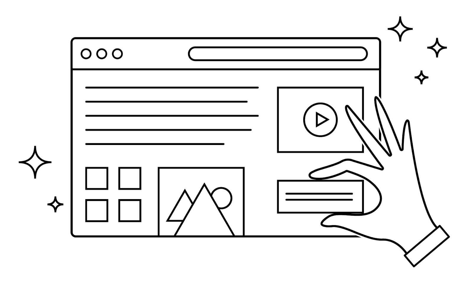
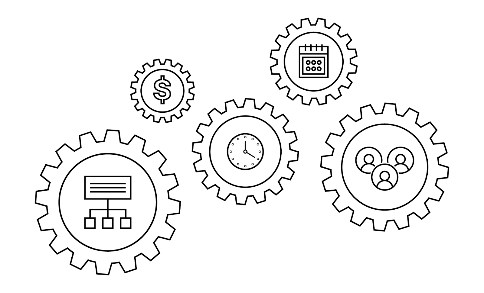
Strong supportive visuals – We live in the age of short attention spans that are more interested in visuals than large chunks of text. So how can you present all the important aspects of your business without boring your audience? The answer is strong visuals such as charts and graphs or even the faces of your people.
- Visual data: Take a minute to evaluate your product or service and determine whether or not adding diagrams such as charts and graphs would be beneficial to site visitors. Keep in mind that data points related to your business often help nudge your visitors towards conversion. By using design to make those key statistics stand out, your content becomes more compelling and more memorable.
- Photos of your team: Incorporating photos of the people on your team is another way to differentiate your business. The human mind is reassured by the legitimacy of real people. Instead of using text to explain who your team is, show them. Your customers want to know who’s behind your brand and who they might work with if they choose to work with you.
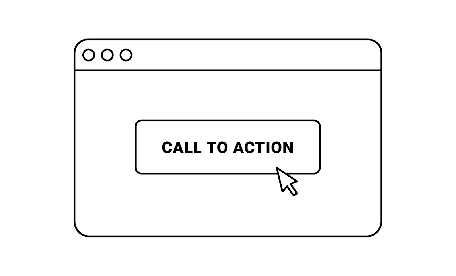
- Compelling CTA: This is the final step to lead your audience towards conversion. Calls-to-action should be used to nurture and guide your visitors to areas of your site that they are interested in such as contact information or where they can go to purchase your product or service. When crafting your CTAs, considering the following:
- A great CTA is welcoming, relevant to the page, and focused on driving demand
- CTA buttons are usually located near the end of each unique section of your site
- Avoid prompting a visitor to “contact now” before allowing them to “learn more” – sometimes potential customers need more information before making the decision to talk to your team
Design
What makes an effective services page design?
Keeping in mind that your website is going to form the first impression for potential leads, it becomes critical to make your pages both welcoming and intriguing. Shaping a great user experience for your visitors has the potential to raise conversion rates by as much as 400% – yep you heard that right.
So how can you design your page layout to influence a quality user experience?
When it comes to the design of your service pages, the goal is to balance design and functionality. The last thing you want to do is overwhelm your visitors with too many graphic elements that confuse and distract them from solutions you provide. Your design should be:
- Interesting enough to entice potential visitors
- Simple enough to maintain focus on your solutions
If nothing else, we advise focusing on making your site buyer centric and mobile friendly. With dozens of other sites offering solutions similar to yours, visitors will not hesitate to go elsewhere if your site has slow loading times or a complicated navigation menu. Not to mention, you may face losing half of your visitors if your site is not optimized for a mobile device.
Now let’s talk about implementation.
We get it, designing or redesigning service pages may seem daunting when there are thousands of unique, effective website designs you could potentially imitate. However, it’s important to begin with understanding your audience. What is their preferred format to consume content on your site? Do they have specific design preferences? In order to begin the process of creating an effective design, you need to design your site as if you were your customer base. After you have a good feel for your audience, a good first step is to utilize wireframes.
What are wireframes? Wireframes help to save you some valuable time during the design phase. Essentially, wireframes are simple layouts that assist in the outlining of both size and placement of page elements such as features, conversion areas, and navigation for your site.
Once you have a good feel for the content you want to include, then you can start crafting your unique story. One of the most important elements of your site is the user experience aspect – you want to guide your visitors through a very clear, compelling story. You can execute this through thoughtful design elements.
Storytelling through design includes…
Colors: There’s a lot of psychology behind color as it has the power to trigger certain feelings. Oftentimes, color has a major influence on what we buy without us even knowing it which is why it’s hugely important to choose the right colors to reflect your B2B website. If you’re hoping to keep it simple, we suggest the following:
- Choose your primary color that fits with your product, service, or industry.
- Select 1-2 additional color(s) that compliment that primary color
- Determine a background color that is muted enough to let those main colors stand out
Every business is different when it comes to the end client they are aiming to appeal to. If you’re unsure what colors or fonts would interest your specific audience, you can always play it safe with softer color palettes such as blues and greens.
Fonts: Sometimes the visual representation of typography can actually say more about your brand than the actual words. Font has the ability to create a quality user experience but it also reflects the values that capture your brand. On top of being easily legible, the web design typeface should reflect the unique voice of your brand whether it’s energetic, sophisticated or bold
Imagery & video: If you’re hoping to provide your audience with interesting content that is both digestible and memorable then the answer is photos and videos. Most people respond better to video which is why 87% of businesses are using video as their primary method of communication. Stories are often told better through visuals and audio that keep the audience engaged.
Animations & interactive components: The last thing you want is a site that is static and forgettable. To avoid leaving your audience unimpressed, you can incorporate interactive elements such as animations that captivate your audience and hold their attention. These elements can differentiate your brand but at the same time contribute to your site functionality.
Visual hierarchy & placement: By arranging elements in a way that conveys levels of importance, your visitors are better able to sift through your site content and guide themselves through your user journey. Don’t forget to adjust the sizing of fonts and graphic elements to make it easier to read and understand.
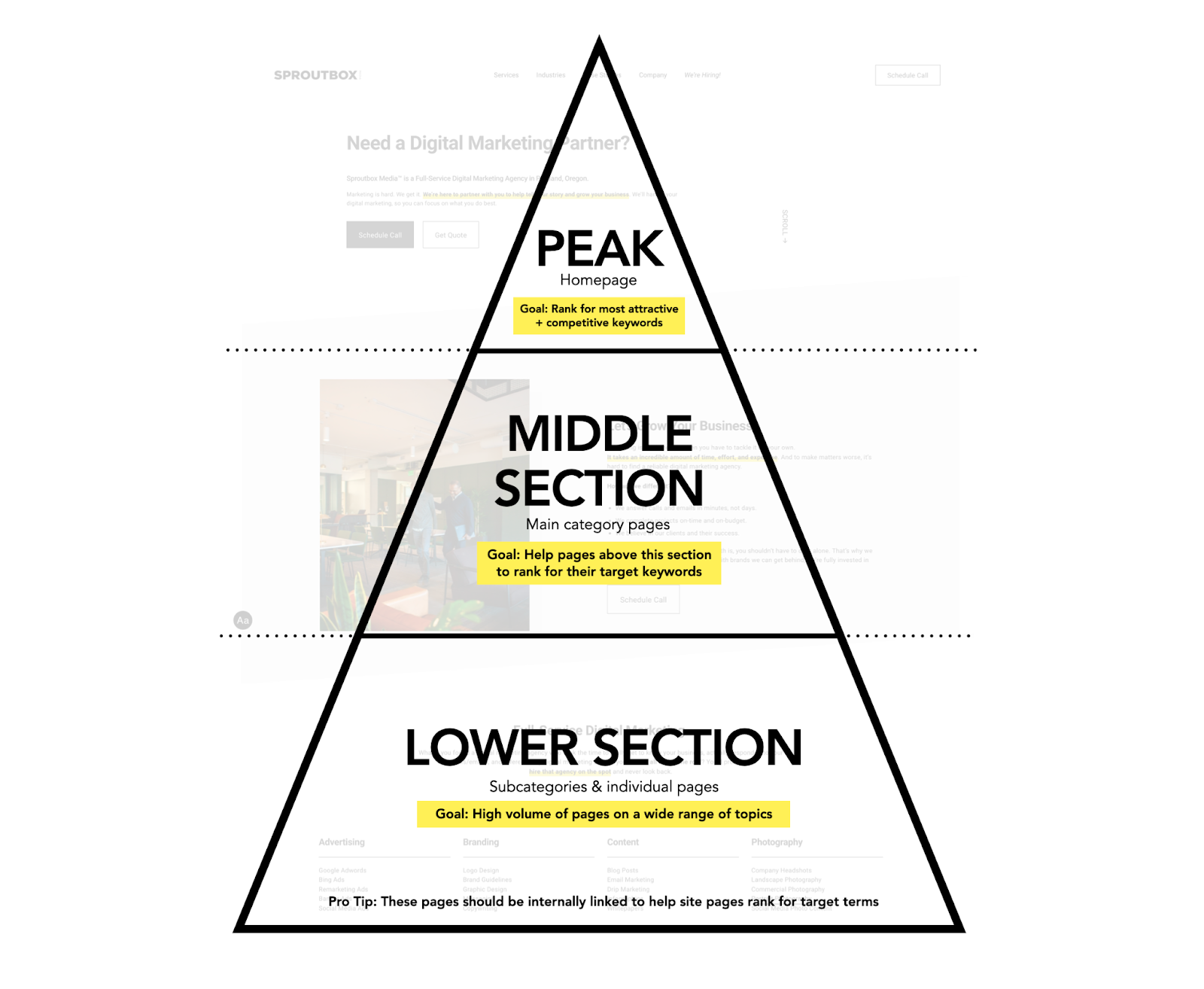
While the visual appearance of the site is crucial, it’s also important to consider the placement of information with search rankings in mind. Search engines will rank your site based on a few critical factors including site speed, functionality, securing, etc. SEO meets service page design when it comes to the order of content on your page – each section of your service page should have different goals and priorities as you scroll through the page. Check out the graphic below for a visual breakdown:
Everything you need to know about implementation
How much does a service page and/or website design cost?
Anywhere between $10-100k depending on if the project entails individual site pages or an entire website built or redesign.
How long does a web design project take?
Typically about 2-6 months depending on a variety of factors including scope of work (number of site pages or complete website design) and depth of product information, services, or offerings.
Who needs to be involved in your website design build?
The key decision-makers on your team, project manager, etc.
What should you pull together before starting a web service page redesign project?
Solid scope including sitemap (list of service page elements), design requirements, development questions, timeline, and budget.
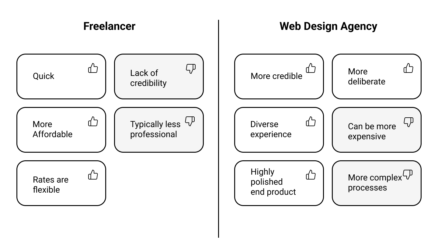
Should you work with a freelancer or web design agency?
There’s really no wrong answer here but there are certainly better fits depending on the unique needs of your company. When making your decision, it’s critical to consider your web project goals. If your goal is to simply establish a web presence, then a smaller agency might be a better choice for you. However, if your goals are to market your brand, sell online, and achieve more complex conversions, then an agency may be a wiser investment for your company.
Why does great web design take so long?
The short answer is, it just does. If you want a site that is dynamic, compelling, high-functioning, and a site that converts, it’s going to take time to do the following correctly:
- Craft a compelling content & messaging strategy
- Develop your unique brand design that converts
- Optimize all site elements for search
- Ensure a great online user experience (for mobile users too)
Even though it can be hard to wait, taking the time to get it right the first time saves money in the long run.
What makes a web design company ‘the right fit’?
Although the answer may be different for every unique business, a good rule of thumb is to look for a good personality fit, quality customer service, a well-developed process, and industry expertise never hurts.
With online presence becoming more and more critical for B2B interactions, you want to choose a web design company who can impress you and your clients. Partner with us >>>
So, what’s in and what’s out?
In
- Simple and concise navigation: Don’t get caught up in all the flashy elements of a website that ultimately make it more difficult for visitors to navigate. Instead try to simplify your layout and graphic elements to make it quick and easy for potential customers to view the important stuff.
- Clear call to action sections: Your site is meant to make conversions. Whether that is selling a tangible product or service, gathering prospective customer information, or gaining email contacts, your site should provide clear direction for visitors and include call-to-action buttons that encourage those conversions to happen. Make your verbiage compelling and relevant to the page. Some examples include “contact”, “learn”, and “click”. Use these CTAs to nurture your leads, otherwise visitors may become lost before they even have the chance to take the next step.
Out
- Carousels and slideshows: While this design approach has been widely used in the past, there is now extensive data proving that both are quite unsuccessful. They hide elements of your site until a visitor clicks and therefore may go unseen. Instead, organize your visual content so visitors can see it while scrolling through.
- Social sharing icons: The chances that visitors are going to share your service page on their social media accounts is slim, making the visual distraction these icons create of no value to your site. It also wastes space that could be used for more beneficial information. If you want to make sure your audience has access to your social media accounts, just include smaller icons in the footer of your site to limit wasted space.
Overall…
At the end of the day, the goal is to tailor your website services pages to your intended audience and guide them through a clear, intriguing story that encourages them to choose you over other businesses in your space.
If it’s been a while since your service pages or website design had an update or if you’re looking to start fresh with a new website that captures your brand image, we’re here to help. Our team specializes in Website Development, Design and Search Engine Optimization – the perfect storm to help your site put its best foot forward with new and current customers.

